
Reducing Cognitive Load in Venue Search
I redesigned Cvent Event Diagramming's venue search flow to help users find faster, scan quicker, and reduce cognitive overload.


PROJECT TYPE
B2B, SaaS,
Event Planning/Management
MY ROLE
Product Design Intern @ Cvent
TEAM
Cvent Event Diagramming
TIMELINE
June 2025 - August 2025
●
TL;DR
Cvent Event Diagramming (CED) is a tool that helps event planners visualize and design event layouts, and is formerly known as Social Tables.
Within it, the venue search flow allows planners to find the specific venues and floor plans they've contracted to start building their diagrams.
●
WHAT I DID
I owned the design process from research to final UI, identifying critical usability gaps and redesigning the venue search experience to make finding, filtering, and differentiation faster and more intuitive for event planners.
Additionally, I utilized Cvent's established design system to reimagine CED's visual design in alignment with core branding and consistency across the product ecosystem.

⌙ Venue Search Landing Page: Before Redesign
●
THE PROBLEM
Where things start to break down
Event planners struggle to locate what they need in Cvent Event Diagramming's venue search, leading to hesitation, backtracking, and abandonment.
●
THE GOAL
What a better experience needs to do
Make venue finding feel fast and intuitive by improving scanability, reducing cognitive load, and helping users confidently move forward.

⌙ User Journey: Friction Points
●
DISCOVERY
What should be a quick search… isn't.
Event planners typically enter this flow with a specific venue already in mind—often one they’ve already contracted.
But instead of quickly finding it, they’re met with overwhelming results, unclear hierarchy, and little distinction between similar venues and floor plans.
The original flow presented a flat, undifferentiated list of venues with no visual hierarchy, minimal filtering options, excessive scrolling, overloaded search results and no immediate distinction between similar venues/floor plans — forcing users to manually scan every result to find what they'd already contracted.
What should be a quick search turns into a frustrating hunt.

Users know what they're looking for, they just can't find it without error.

⌙ Search Results: Edge Case Redesign
●
METHODS
Understanding the gap between what planners need and what they had
Datadog Session Analysis
Observed 10 user sessions to understand where users were experiencing friction.

Internal Audit
Audited Cvent's venue sourcing platform to see what planners might expect before coming to CED.


Design Workshop
Led a workshop to ideate on gaps and preliminary design ideas with my team.


●
KEY RESEARCH INSIGHTS
What I Discovered
User feedback and observations highlighted three key areas shaping my design approach:
1
Navigation & Structure
Users struggled to find the venues…
they were looking for because the layout felt empty and confusing.
2
Search Efficiency
Users found searching frustrating…
when results were poorly organized or too overloaded, and would often abandon the search process.
3
Action Clarity
Users were unsure what actions were possible…
or what elements were clickable, which slowed their progress.
●
HOW MIGHT WE
How might we help planners efficiently search and find desired venues and floor plans, reduce cognitive load, and prevent abandonment of the search process?
●
EXPLORATION
From ideation to visualization
Guided by these 3 key areas, I explored several early solutions through sketching and wire-framing.

⌙ Early Concepts: Sketching
TRADEOFF #1
AI Personalization vs. Filtering Clarity

Cross-platform data linking introduces technical ambiguity
Initially explored incorporating a section to display a user's recently contracted venues for added personalization, which would involve cross-platform linking.

No cross-platform linking = less ambiguous feasibility
Due to technical ambiguity, I decided to pivot to a general AI suggested venues section, which would rely only on user data and patterns within the platform, rather than other platforms in the Cvent ecosystem.
TRADEOFF #2
Filter Interaction Model

Too many clicks
Initially explored multiple drop downs for different filters, but this caused too many clicks and potential cognitive overload.

Less clicks, quicker filtering
To address this, I consolidated multi-option filters into one drop down, and surfaced binary toggles next to it.
TRADEOFF #3
Saved vs. Unsaved Separation

Users don't see below the fold
Usability testing with 2 participants revealed that users frequently assumed the search results page ended after the first set of venues and didn’t realize additional content existed below the fold.

Users know what their options are
To address this, I consolidated Saved & Un-Saved venues into one section, while still preserving hierarchy by having Saved venues appear first.
●
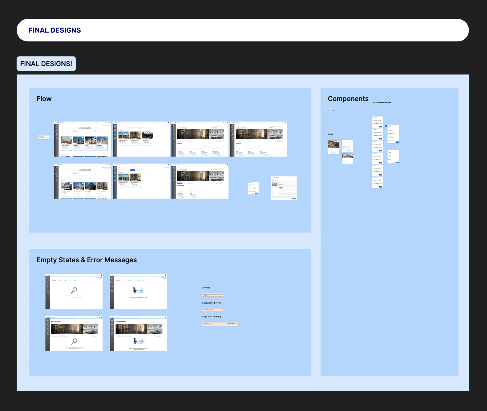
FINAL SOLUTION
A search flow that prioritizes relevant results, boosts scanability, & improves user confidence.

BEFORE
Users had to read through a dense text list to find their venues
Users had no idea how many results existed or which were most relevant
Users had to dig through collapsed sections to find floor plan details
AFTER
Users can visually scan saved venues at a glance with photos and key details
Users see only top matches with a clear count, tags, and filters up front
Users can immediately see venue photos, room specs, and jump straight to diagramming

Navigation & Structure
Redesigned layout to support natural scan patterns and hierarchy. Clearer flows between search results, individual venues, and floor plans.


Search Efficiency
Enhanced filtering and sorting. Updated algorithm to show the most relevant venues based on user input to reduce cognitive overload.


Action Clarity
Clarified buttons and actions to reduce friction. Improved visual cues to make next steps obvious.

●
RECOGNITION

Great job using the design system so well in your prototype & design. Huge win.
— Lead Product Designer @ Cvent
Great work tying your design decisions to outcomes for the users!
— Principal Product Designer @ Cvent
●
IMPACT & REFLECTION
Usability testing with 2 participants caught a critical layout issue before final delivery — users weren't scrolling past the first result section, assuming the page had ended. Consolidating saved and unsaved venues into one ranked section resolved this entirely.
The redesigned flow addressed 3 failure points confirmed through 10 Datadog session recordings. Designs were presented to Cvent's full technology department and received direct recognition from Product Designers for design quality and design system alignment.
If this shipped and was measured, I'd want to track: search abandonment rate, time-to-venue-selection, and error/backtrack rate — the three behaviors Datadog originally surfaced.
Huge thank you to my mentor, product team, fellow interns, and managers! :)
10
Datadog sessions analyzed
3
Core failure points resolved
2
Usability test participants
Built from curiosity, shaped by empathy.