Driving Engagement in Buying Meal Kits
[ End-to-End UX Design / Mobile eCommerce / 10 weeks ]
My team & I designed a mobile eCommerce app that helps busy users discover, customize, and order healthy, cuisine-diverse meal kits
— without the friction of cooking or grocery shopping.

[ PROBLEM ]
Where existing meal kit apps fall short
Meal prep is time-consuming, but the apps meant to solve that problem introduce their own friction. Existing services feel generic — limited variety, poor customization, and little to motivate users to keep coming back. For busy people who want to eat well and explore new cuisines, nothing on the market truly meets them where they are.
[ GOAL ]
What a better experience needs to do
Build a meal kit app that makes discovery feel exciting, customization feel effortless, and repeat engagement feel rewarding — tailored to users with diverse dietary needs and busy lifestyles.
[ DISCOVERY ]
Convenience without compromise
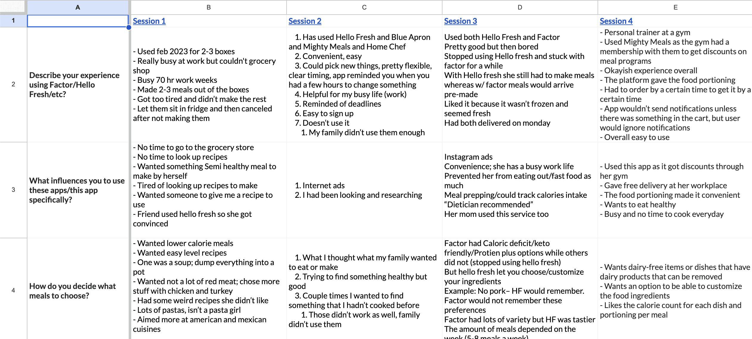
Through 4 user interviews with participants ranging from college students to working professionals, a clear tension emerged: people want the ease of pre-made meals, but they don't want to sacrifice variety, dietary transparency, or a sense of ownership over what they're eating.
Existing services were failing on all three fronts.

Users weren't asking for less — they were asking for more of the right things.

[ METHODS ]
What We Did

User Interviews
Conducted 4 interviews to understand how people approach meal planning, what frustrates them about existing services, and what would motivate them to try and stick with a new one.

Competitive Analysis
Evaluated existing meal kit services across browsing, filtering, and customization to identify gaps and best practices to build on.

Persona Development
Synthesized interview findings into 2 personas representing varied lifestyles, meal preferences, and dietary needs to anchor design decisions.

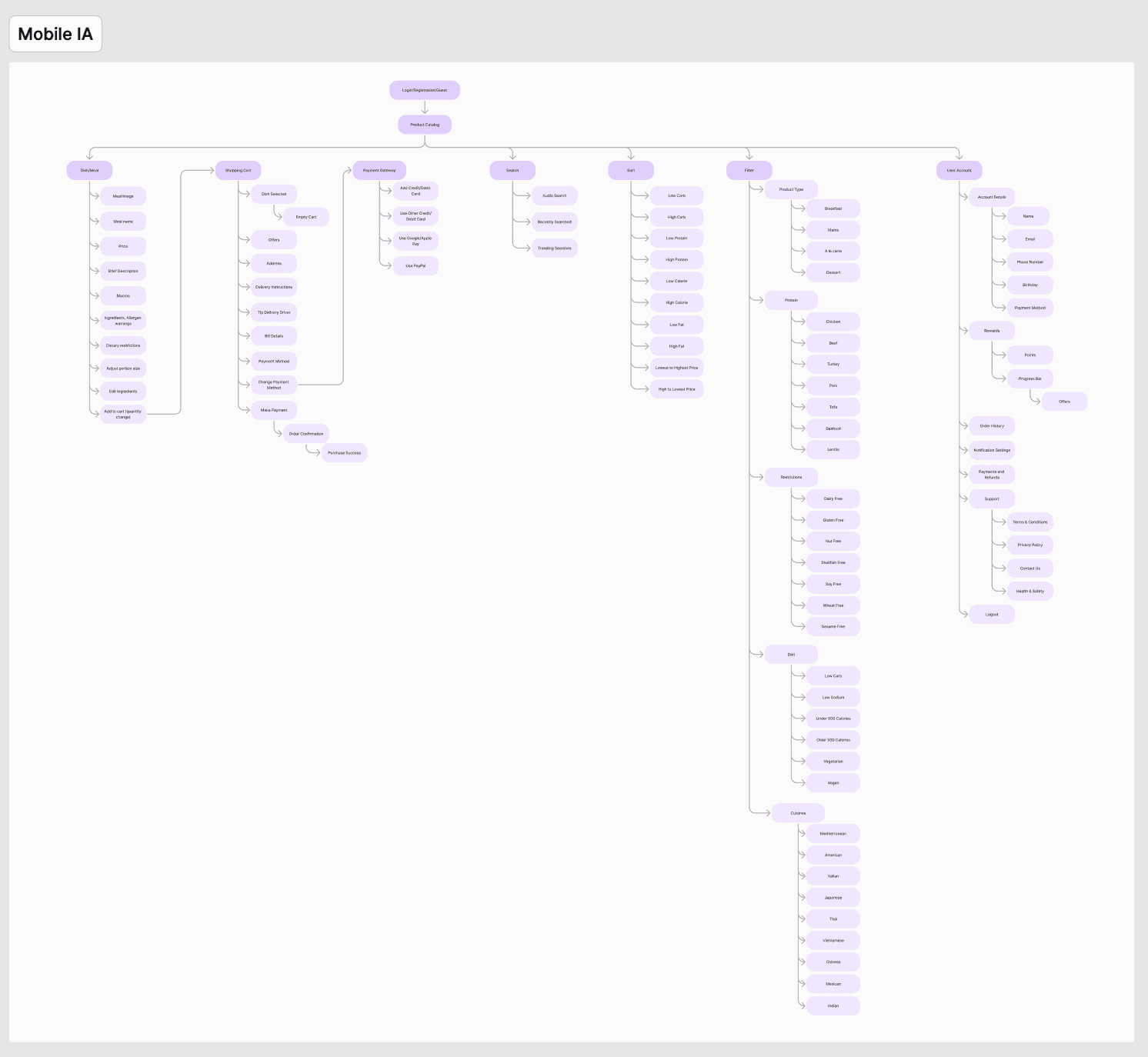
Information Architecture
Mapped end-to-end flows in FigJam — from product catalog to checkout — to establish a navigation structure before moving into visual design.
[ FINDINGS ]
What We Discovered
Research pointed to three areas shaping our design approach:

Meal prep is a time burden
Users consistently described cooking and grocery shopping as stressful time consumers, not enjoyable activities. Convenience was the whole point, and they weren't getting that.

Existing services lack variety and customization
Participants felt current meal kit options were repetitive and culturally narrow. There was a clear appetite for cuisine diversity and dietary flexibility that the market wasn't meeting.

Nothing motivates continued use
Users had tried meal kit services and lapsed. Without engaging features or reasons to return, these apps felt transactional rather than something to look forward to.

[ HOW MIGHT WE ]
How might we help users find, customize, and enjoy diverse, healthy meals in a way that fits into their busy lives — and keeps them coming back?
[ EXPLORATION ]
Wireframes + ideation!
Guided by our three focus areas, the team moved from personas and competitive insights into wireframing. Early iterations were tested for usability and refined through team feedback before progressing to high-fidelity design.
My key focus areas/contributions included the Home Page, Meal Cards, and the Rewards Page.
Two key tensions emerged during exploration:


[ TRADEOFF #1 ]
Meal Card Information Density vs. Scannability
Early meal cards included rich dietary detail, but too much information slowed browsing. We refined the balance — surfacing dietary icons for quick scanning while reserving deeper detail for the meal page — so users could make fast decisions without feeling uninformed.
[ TRADEOFF #2 ]
Rewards: List View vs. Progress Indicator
An early rewards concept displayed a static list of available rewards, but it didn't convey a sense of progress or journey. We shifted to a visual progress indicator paired with milestone markers, giving users a tangible sense of how far they'd come and what they were working toward.


[ FINAL SOLUTION: MY KEY CONTRIBUTIONS ]
A meal kit experience built for discovery, confidence, and return.

Home Page
A personalized entry point with a moving hero slideshow, curated sections like "Order Again" and "Featured Meals," and quick access to search, filter, and cart. An icon key reduces the learning curve for dietary information at a glance.

Moving hero slideshow to demonstrate brand alignment and convey personality
Search, filter, and cart access for findability
Key for information on card icons
'Order Again' and 'Featured Meals' for easy access to curated/potentially relevant meals

Meal Cards
Large, birds-eye food photography draws users in. Dietary icons, cuisine type, calorie count, and a quick-add button let users browse and decide without leaving the feed.

Colorful, birds-eye view of meal to draw user in
Dietary icons to indicate ingredients — requires some learning
Meal information (Name + Cuisine + Calories)
Quick add to cart for easy browsing + shopping

Gamified Rewards
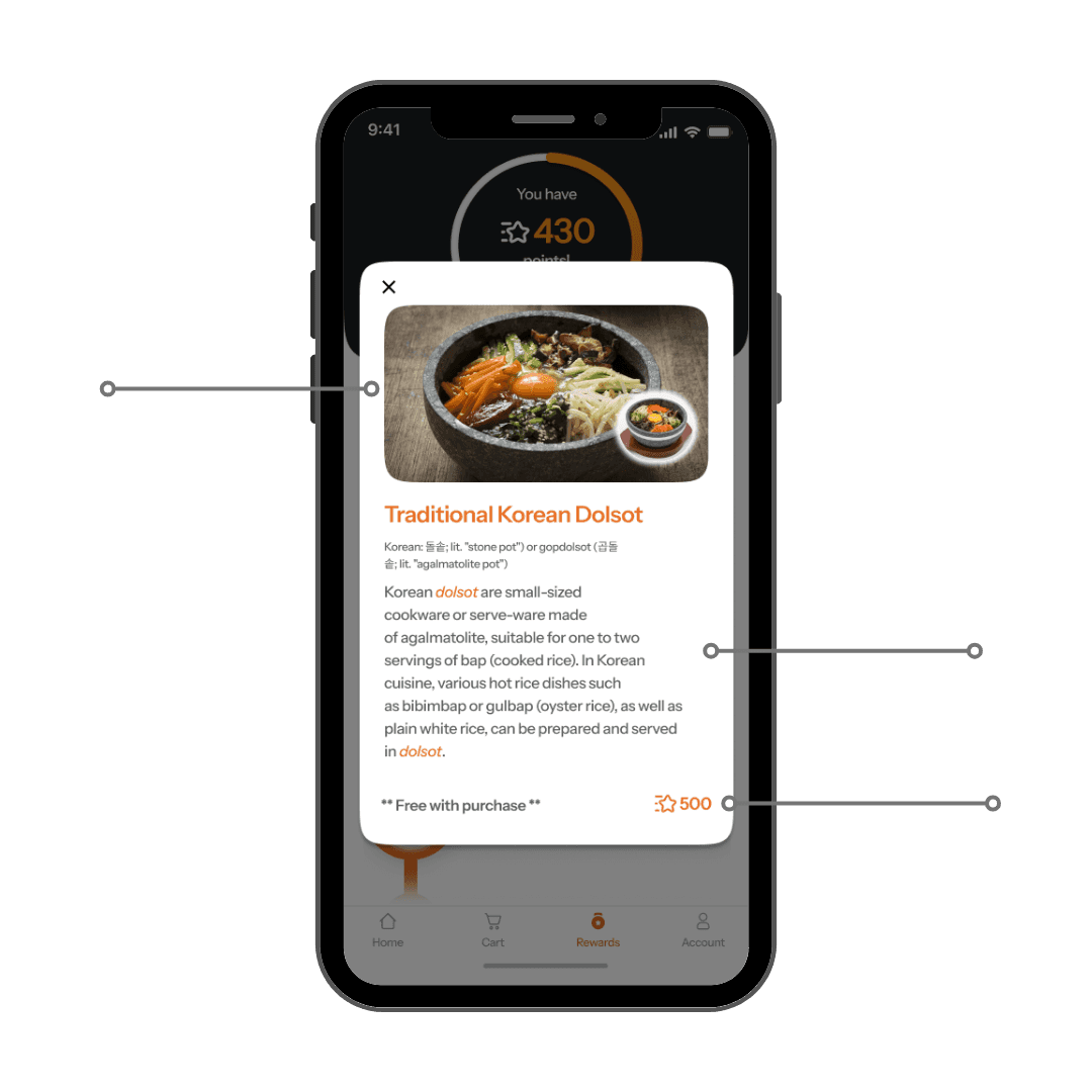
A progress indicator and interactive milestone bar show users where they stand and what they're earning toward. Rewards include both discounts and culturally meaningful free items — reinforcing the app's core identity around food exploration.

Progress indicator + interactive bar showcasing rewards journey
Reward w/ photo + click for description
Progress circle to showcase number of points and how close until the next milestone

Visually engaging photo of item + photo of what user will receive
Description of item + cultural usage
Disclaimer + rewards cost
[ IMPACT & REFLECTION ]
Dishcovery pushed me to connect every design decision back to real user needs. The rewards system in particular taught me how engagement design can reinforce a product's core purpose — in this case, using cultural food discovery as both the hook and the payoff.
Working across research, IA, visual design, and prototyping in 10 weeks forced prioritization and sharpened my ability to move quickly without losing the thread of the user's experience.
Huge thank you to my team: Hannah, Ayesha, and Trusha for their great work! :)
Built from curiosity, shaped by empathy.


